Showing posts with label stamptv challenges. Show all posts

Monday, September 27, 2010

StampTV Color Challenge | Black, Yellow and One Cool Color

I made this Christmas card using the colors from Janice's color challenge over at StampTV.com.  They are not traditional Christmas colors, but I like how they go together. I would have never thought to put Black, Yellow and Blue together without her color challenge.

Paper: PL Black Onyx, Lemon Drop, & White + KandCompany Que Sera Sera
Other: CB Swiss Dots and Sizzix Diamond embossing folders + Labels Trio Spellbinders Die, buttons, Dandelion grosgrain ribbon and white DMC embroidery floss

Sunday, September 05, 2010

I am so happy about the wonderful cool temperatures we are having. I could not have asked for better weather on my 3 day holiday weekend. :o) I am so ready for fall weather. And speaking of fall; the colors for the Color Challenge over at StampTV remind me of a transition from summer to fall. The colors are Yellow, Dark Brown and Ivory. The soft yellow representing the warm sunshine and also the beautiful shade the leaves take on when they are beginning to change colors. Here is a card I made using the colors this week.


I stamped the Ivory layer with floral images from the new Gina K set Lean on Me. The sentiment is from another new set called Faithful Florals. the layout is similar to the layout I used for my last CSS blog hop card. What do you think of that flower with the ribbon? I went to Stamp-ede Rubber Stamps, the local stamp store in York, PA and found these really cool dies. The die cuts the flower piece with the slits so you can string ribbon through them and then through the center hole. The manufacturer is Marianne Designs. She has a website, but it is not in English. But you can see some beautiful cards created with the companies stamps and dies. The website is http://www.mariannedesign.nl/

Stamps: Lean on Me & Faithful Florals
Paper: Pure Luxury Chocolate Brown, Sweet Corn & Ivory
Other: CB Embossing Folder, chocolate stitched ribbon & ivory ribbon, flower die (marianne designs), chocolate brad

Tuesday, August 10, 2010

StampTV Sketch Challenge #11

It is the 11th week for me hosting the StampTV Sketch Challenge. This week the sketch is from a card I shared a few weeks ago. Since my grandmother passed away last week, I have not had time to do a lot of stamping. I actually spent the day sewing on Sunday. She loved to sew and it was a way to remember her.

Here is the card for the sketch challenge this week:


I also started a RAK group over at StampTV.com. RAK is an acronym for Random Acts of Kindness. So far we have 10 members and would like to have many more join us so we can start sending out happy mail. Please come on over and join our group. You will need to be a member of StampTV (which is free) and then you need to request access to the group. This is so we can moderate who has access to our addresses. We don't want spammers getting the list. They don't send happy mail.

Wednesday, June 16, 2010

StampTV Sketch Challenge #3

I am adding a quick post for the sketch challenge this week at StampTV.com. I decided to get away from a blocked sketch and try some layered ovals.


Here is my card for the sketch...


You can see all the details about the challenge, including how to be entered to win free stamps.
 

Tuesday, June 08, 2010

StampTV Sketch Challenge #2

It's my second week hosting the Sketch Challenge over at StampTV.com.  You can check out the challenge details and find out how you could be entered to win FREE stamps here.  That's right, Gina K Designs hosts five different weekly challenges and there is a chance to win FREE stamps with every challenge. In this economy that's the perfect price. :o)

For my card I decided to use some yummy digital papers designed by the talented Nina Brackett for Gina K Designs.  I love bright colors and these papers are bright and beautiful. I stamped the butterfly using the Rock and Roll technique. I first inked the stamp with Memento Tangelo and then rolled the stamp edges in SU's Elegant Eggplant.  Then I stamped it on Pure Luxury Wild Dandelion, leaving a small border.  I colored parts of the butterfly with the Stardust Glitter pen to add some glitz.  I also dusted off the sewing machine for this one.  And added a fun strip of pearls on the dark purple ribbon strip.


Tuesday, June 01, 2010

StampTV Sketch Challenge #1

I am so excited to be the new sketch challenge hostess over at StampTV.com.  When I received the invitation from Jessica I about fell off my chair. I was so jumping up and down and squealing with delight. Yeah, I get a little crazy some times. 

So here it is, June 1st, and it is the first day for me to host the challenge.  I tried to keep the layers to a minimum for this sketch. You can really make it a Clean and Simple project or you could go crazy with accessories and extra dimension. I went a little crazy with the rhinestones. LOL!

Here is the sketch...


And here is the colorful blinged out card I made using the sketch...


Stamps: Stars
Other: Lots of rhinestones and a strip of green ribbon

Please stop by the challenge thread and join in. With every challenge there is a random drawing to win a free stamp set from Gina K Designs.  You can read about it here.

Saturday, May 22, 2010

I made this red, white and blue coffee card for Tina's color challenge over at StampTV.com.  I used Rocket Red, Pacific Point, Baja Breeze and White.  The images are from Heartily Yours and sentiment from Heartily Yours Additions both by Gina K Designs. Card size is 4" x 8".


I will be back tomorrow to share some more projects. Have a fabulous Sunday!

Monday, May 17, 2010

Repurposed Napkin Holder

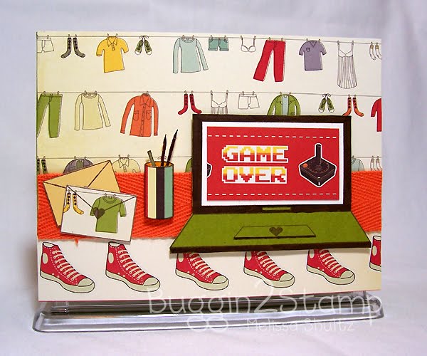
Over at StampTV.com Karen's latest Anything But a Card challenge is earth friendly. She challenged us to re-purpose a napkin holder.  I didn't have one already, so I stopped by the Dollar Store on Sunday after church to pick one up. Then I proceeded to make it over with some cool new paper I found. It is from Cosmo Cricket's The Boyfriend collection.  I love the hanging clothing and the Game Over with the old school Atari joystick.  I used images from the Tech Talk stamp set by Gina K Designs. Being a techno geek, I love that set. :o)  I think I'll take this to work to hold some items on my desk; like my notepad and such.


Stamps: Tech Talk
Paper: Pure Luxury Green Apple (laptop and wrap for napkin holder sides), Sweet Corn (envelope) and Ivory (computer screen) AND Cosmo Cricket The Boyfriend
Ink: Memento Rich Cocoa

Tuesday, May 11, 2010

Inspired by Spongebob's BFF Patrick

Yes, my title says it all.  LOL! 

So, Gina's challenge this month is to be inspired by your favorite movie.  Most of my favorite movies are science fiction and mainly those that take place in space.  You know, Star Wars, Star Trek, Stargate, etc.  Maybe I am really an alien?! 

Anyway, one of my favorite non-sci-fi movies is Spongebob Squarepants The Movie.  Spongebob and Patrick crack me up. Makes me feel like a Goofy Goober! :o)  So I chose to use that movie as my inspiration.

The set I chose to use is Quite a Catch. How perfect that there is a starfish image that reminds me of Spongebob's BFF, Patrick. If I slapped a pair of tighty whiteys on him who would know the difference, right? LOL! 

Of course I had to make him a pink/coral color like he is in "real life".  So I stamped him onto Pure Luxury (PL) Innocent Pink card stock and colored his eyes with a white gel pen to give him some life.  I had to mix in some yellow for good ol' Spongebob, so I cut an oval from PL Lemon Drop as his backdrop. I stamped "Don't Worry Be Happy" from the set because Spongebob and Patrick seem to live this motto.  I embossed with the Swiss Dots folder to make it look like bubbles surrounding him.  The green layer is actually paper with fish swimming.  I embossed it with the Mosaic folder.  I layered that on some more PL Innocent Pink. The card base is PL 120 lb. White. Love that stuff for card bases!!  I used Vicki's sketch for this week as my layout.  When I look at the starfish on this card it definitely makes me want to smile. :o)


And here is the movie cover image that gave me my inspiration.


If you haven't seen this movie and have a goofy sense of humor, you've got to check it out.  I need to borrow it from niece and watch it again.

Thursday, May 06, 2010

Spring Flower Basket - Inspire 22

Over at StampTV.com Gina has a video this week that shows you how to make these adorable baskets. She is so amazing with the awesome videos she shares each week.  The weekly Inspire Challenge is to use flowers. I decided to make this one as I watched her explain it. I cannot believe I created this in less than an hour. It usually takes me hours to make something, but I guess Mr. Mojo was paying me a visit tonight. :o)  And it felt good to create something after the stressful evening I had. 


I used Turquoise Sea to make the basket and Lipstick Red for the accent color.  The pattern paper is from my Basic Grey Urban Prairie 6x6 pad. Stamps are from the latest Spring StampTV Kit. This is the first time I inked up the pretty daisy stamp.  It's my favorite flower. I will need to get some goodies to put inside and find someone to give a fun little gift to.

I only have one more day of work. Yeah!  Stop by tomorrow night after 10 pm CST for the Gina K Designs, Quite A Catch blog hop. You will surely be inspired after seeing what the design team and CSS alumni from StampTV have to share. Have a super Thursday!

Sunday, May 02, 2010

Vintage Box of Cards

Over at StampTV.com Sharri's Blast From the Past challenge for this week is to make a box of cards.  I decorated a plastic card box using a large doily stamp from Nana's Needlework.  I blinged it up with some adhesive back half pearls, a large pink button and a white flower I sponged with yellow ink. 

I made four cards to put in the box.  I used the sketch from "Just Us Girls" challenge this week. I chose some vintage colors to use on the cards, Lemon Drop, Innocent Pink, and Turquoise Sea along with Black Onyx and White as my neutrals.  All from the Pure Luxury line at Gina K Designs.  I can't say how much I love this card stock. It is so thick and sturdy. And she released a new color that I think is my favorite, Turquoise Sea. :o)  Four the main focal images of all the cards, I stamped the image on white card stock and created a mask of the same image with a post-it note.  I masked the image and sponged around it with either Barely Banana or Pink Pirouette ink.  I liked the look of the sewing machine left white and just added a hint of color on some of the pieces of the machine with Copic markers.  I decided to color the dress on the woman to match the Turquoise Sea card stock but made it a few shades lighter.  All stamps are from the new set, Sew Pretty except the "Happy Birthday" is from Nana's Needlework Sentiments.  I kept the cards fairly simple to fit in the box and did not use any ribbon, gasp! "Sew", here are the four cards:


Sunday, April 25, 2010

Fish and Flowers and Lots of Challenges

I've been doing some major therapy and finished several cards for challenges this weekend. I am having a lot of fun with two Gina K Designs stamp sets illustrated by Theresa Momber.  Here is what I have to share so far.


I made this fish sweatshirt card for the Release Party Sketch Challenge hosted by Theresa over at StampTV.com.  I wonder if she realized that the little fisher guy in her set, Gone Fishing, makes the perfect "i" for the word fish from her Eat. Sleep. Fish sentiment. I discovered this by accident and decided to use it on a sweatshirt stamp from Just So Sporty. I stamped the sweatshirt on white and blue sheets from the Basic Grey Granola pad.  I cut the sleeves and hood from the blue shirt and paper pieced it to the white shirt.  I also stamped the "F sh" from the sentiment stamp using a black marker to omit the "i".  Then I used a Stamp-A-Ma-Jig to line up the little fisher guy. The sweatshirt is mounted on a piece from brown paper from the same pad and then mounted on Pure Luxury Black Onyx.  I used a real piece of burlap and stitched the border with black DMC embroidery floss.  Stampin' Up's retired Blue Bayou matched the blue from the paper pad perfectly. I inked up a small piece with the same color ink using the SU background stamp, Sanded.  The striped piece is also from the Granola pad.  Attached some pewter brads and put it all together on a PL Black Onyx card base measuring 5" x 6.5". 


Next is this card I made for Lee's Release Party Color Challenge. She challenged us to use Aqua, Lemon and a neutral.  Most people were using white as the neutral so I decided to pick a different color.  I chose Pure Luxury Chocolate.  The aqua is Cool Caribbean and the Lemon is Pure Luxury Lemon Drop along with some lemon colored paper from Basic Grey Origins paper pad. I love the font used for the Happy Birthday sentiment from the set Sending Sunshine and could not resist using it here.  The daffodils are also from Sending Sunshine.


The paper flower on this one was originally intended for the Color Challenge card but was too big.  So I decided to make another card with the similar color scheme, but adding some Kraft and a piece of green satin ribbon. Sentiment and butterflies are from Sending Sunshine.


My final card is my entry for Tina's color challenge to use Ocean Mist and Tan Leather with a neutral.  I used the spotlight technique on the flowers and kept the card simple.

I hope you enjoyed your weekend. It had been dreary here and sign of sunshine for the next few days. Good stamping weather. :o)  Back to work tomorrow and another crazy week.  If you have time, please leave a comment let me know what you think or if you have any questions about anything I've shared.  Make it a fabulous week!

Saturday, April 24, 2010

Transparent Bookmark

Karen has an awesome challenge this week over at StampTV.  She hosts the weekly, Anything But a Card challenge. This week the challenge is to make a bookmark using a folded piece of plastic or transparency sheet and embellishing it with stamps and other fun stuff.
I made a masculine bookmark with the new Gina K Designs stamp set, Gone Fishing. I stamped the Cat O Nine Tails with white Stazon onto the folded transparency. I stamped the fisherman and the sentiment with Night of Navy on Pure Luxury Kraft card stock and cut it out with the Labels One Nestabilities die. I drew a fish line with a white pen and I coated the word FISH with glaze ink from a Sakura glaze pen. I added some brads in the corder for a manly hardware look. The Pure Luxury In The Navy mat layer is also cut from a Labels One die, the next size up. I embossed it with the Argyle embossing folder and adhered it to the transparency sheet. Then I wrapped the striped ribbon around with the ends meeting in the middle front. I also added a small ribbon tab to the top. Finally I adhered the Kraft layer with 3M foam tape.

Sunday, March 21, 2010

Gina K Designs March Release Sketch Challenge

I am adding a quick post tonight. I made this coffee card for the Gina K Designs March Release Sketch Challenge being hosted by Lee Murphy. 


I used the coffee mug from the Signs of Autumn and the sentiment is from Heartily Yours Additions.  I have been trying to make a point of doing more stitching on my cards. I really love the look and never seem to get my sewing machine out.  I stitched around the border of the yellow panel with a straight stitch. And I used a zig zag stitch to attach the ribbon to the two Wine strips.

Ink: Memento Tuxedo Black, Copic markers {R59, E37, E31}
Other: Labels 8 Nestability Die, Paisley Embossing Folder

Friday, March 19, 2010

Monochromatic Monogram Cards

Wow, Gina's party was hoppin' last night. It is StampTV.com's First Birthday and the release party to celebrate was so much fun. And Gina hosted the party at StampTV.com this time.  So much more organized and really felt like home.  There are a bunch of challenges posted and we have until Monday to participate.  I made the following two cards for Donna's Monochromatic Monogram Card Challenge.  I decided to use black and shades of white for my monochromatic colors.

This is my funky card for the challenge.  I bought that paper a few months ago and finally had a chance to use it. 

And this is my elegant card for the challenge.  I found this pattern paper in my stash and have no idea how long I've had it.  I adde the pearls to make it look more real.

For the main image on both I printed the text with Publisher in 2" x 3" boxes.  I used Nestabilities Dies to cut out the white and black panel.  Then I stamped the scroll design from Vintage Borders above and below the text.  I used a Stamp A Ma Jig to line it up.  It is a little hard to see, but I drew a silver outline on the white text panel with a gel pen.  I also did some real sewing on this one.  I love the look of real stitching on cards and need to make a point to use my sewing machine more often.

After doing this challenge I definately want to make more cards like this.  They would make great gifts for people who like to send little notes to friends and family.

It is supposed to be warm and sunny here in south central PA tomorrow.  Great weather to move my sister. Have a beautiful weekend!

Thursday, March 11, 2010

StampTV Sketch Challenge

I have a quick post before I head off to sleep.  I made this card using Vicki's sketch challenge over at StampTV.com.  I discovered tonight that Basic Grey now offers some of their papers and other items as digital downloads. How cool is that?  I love Basic Grey.  The floral and purple prints on this card are digital paper download from Basic Grey.  They were only 75 cents each and you print them any size and as many times as you need them.


Stamps: Little Tees {Gina K Designs}
Paper: Pure Luxury Kraft {GKD}, Vintage Violet {SU}, Digital Paper {Basic Grey}
Ink: Wisteria Chalk Ink {ColorBox}, Rich Cocoa {Memento}
Other: large scallop border punch, ribbon, mosaic CB embossing folder, Nestability scalloped rectangle die

Thursday, March 04, 2010

Pink and White and Oh So Girly

I made a pink and white card for Tina's color challenge over at StampTV.com.  She is the new color challenge hostess for the next three months and this is her first challenge.  I have to admit this was quite a challenge for me.  I love pink. But is was very hard not adding any other colors. Just Pink and White.  So I went with a monochromatic card.  I pulled out some old Bazzil pink card stock I had in my stash.  And I pulled out an older set. When Gina first released the Little Tees set I instantly fell in love.  I just adore the mini t-shirt in this set.  And it has been a while since I've used yet.  So I dusted it off for this challenge.  So here is my Pink and White card:


Details:
I stamped the mini t-shirt from Little Tees on both PL Passionate Pink and some Bazzil pink card stock.  I cute the entire tee out of the Passionate Pink.  From the lighter pink I trimmed off the sleeves and collar and layerd them together.  I stamped the larger butterfly from Dream Birds onto the bottom corner of the tee and colored the body with a white gel pen.

I made the background with a piece of PL White card stock embossed with an inked embossing folder.  The ink did not completely cover it, but I like the look anyway.  I added a big white flower with a cute little pink button.  I made the bow with the Bow Easy. First time I've used that since it arrived.  It is easy after a few practice bows.  And finally I used the LOVE phrase from Dream Birds and added some funky little white dots with a gel pen.

Wednesday, March 03, 2010

Hope is Faith Color Challenge

It took me a while to decide how to incorporate the Hope is Faith set into Gina's Color Challenge.  I actually started looking through my pattern paper stash for inspiration and found a beautiful piece with pink and blue very close to Innocent Pink and Ocean Mist.  So that helped me decide which colors to choose. I added in some Lipstick Red for contrast and was ready to start creating.  Then I had to decide what layout to use.  So I started looking at some of the card photos.  I found a card with the same fold I used for this card and decided to use that.  I don't recall what this fold is called but I think it is very cool and worked well for my design.  After watching a couple of episodes of Little House on the Prairie and some Starbuck's ice cream my mojo arrived and I was able to put the card together. LOL!

Here is the card closed.  You can click on the picture for a larger image.

Here is the card opened.


The top panel fits over the inner panel to hide it until it is opened.

I embossed the butterfly on Pure Luxury White with Memento Rhubarb and VersaMark ink with clear embossing powder.  You can ink your stamp with VersaMark ink first and then with the dye ink of your choice to emboss with clear embossing powder.  The VersaMark ink helps the ink stay wet longer so you have time to add the clear embossing powder.  I cut it out and shaped the wings.  I also sponged a light layer of Cool Carribean and Pink Pirouette onto areas of the wings.  And then I added some rhinestone bling to her body.

I used some silouhette floral stamps from Framed Flowers and Elegant Flowers on the white panel with pink, Cool Carribean and Rhubarb.  I added some liquid pearl drops to the centers of the red flowers.  The Lipstick Red panel and the Ocean Mist back panel are both embossed with Swiss Dot embossing folder. I tied the pattern paper that inspired me into the card by adding some to the front half and the sentiment panel.  Finally, I tied some red and aqua ribbon on the side panel and added some more bling.

I think this is one of my favorite color combos.  I just love red, pink and aqua together.  And works well with so many occasions and holiday.

Tuesday, March 02, 2010

Dream Birds Color Challenge

I fell in love with the adorable images that Asela illustrated for Gina's new set Dream Birds. I love coloring and the images from this set are so much fun to color. So when I read Gina's blog post about participating in the Illustrator Color Challenge and enter to win a chance to be the CSS Designer for the next release, I knew I was ready to go with this set.  Here is a link to Gina's challenge.  And here is my card for the challenge.


For those of you that want to know how I made the card, here are the details:

I actually used more than two of the spring colors.  I used Creme De Menthe, Ocean Mist and Lovely Lavender

For the green layer I stamped the stars from the set on Ocean Mist and Lovely Lavender card stock with Cool Carribean and Pale Plum ink.  I cut out the large and medium stars.  And yes it took forever. LOL!  I glued them to the Creme de Menthe layer and then ran it through my Big Kick with the Mosaic Cuttlebug embossing folder.  I think the embossing makes it look like it is quilted.  I finished it off with some stitching around the edges. 

Now that did not take nearly enough of my time, so I decided to paper piece the entire main panel. I started by stamping the branch and the sentiment on a piece of heavy weight Pure Luxury white card stock.  I cute the white panel using the Labels Eight Spellbinders die.  I cut the next size larger from Chocolate Kiss card stock and ran it through a Sizzix flower embossing folder before applying the white layer onto it with Scotch foam tape.

Then I stamped the branch on a piece of woodgrain paper from Cosmo Cricket Nutgmeg Mini Deck pad, cut it out, and applied it to the white layer. 

I stamped the leaves part of the branch image on Creme de Menthe twice.  I ran it through my little Xyron Sticker maker.  That thing was very handy for this part of the project.  I cut out the little leaves from one of the stamped portions and applied them to the white panel.  Then to add even more dimension I cut out some of the leaves from the second stamped portion and applied them on top of the already pieced leaves.  Whew!!! 

I stamped the cute little bird on a piece of Lemon Drop (oh yeah, I used some of that too) and a piece of Ocean Mist.  I cut the whole bird out of the Ocean Mist and just the belly portion out of the Lemon Drop.  I glued the Lemon Drop layer onto the Ocean Mist layer and added him to the white panel with some Scotch foam tape. 

I stamped the smaller butterfly on some Lovely Lavender card stock and cut it out.  I colored the body with a white gel pen.  I applied the butterfly with some more Scotch foam tape.

Finally I created a little ribbon button treatment with some blue gingham ribbon and purple grosgrain ribbon from the Spring Ribbon Assortment.  The green and blue buttons are from the Spring Button Assortment.  I used a little DMC white embroidery floss to tie the ribbons together and then tied them around the criss crossed ribbon.

So there it is. I really like how it turned out.


Saturday, February 13, 2010

Release Challenge #1 - Gina K Designs

Gina K had her Release Party Thursday night and it was hoppin'.  As usual some of the Design Team girls posted challenges.  Nina posted a challenge to use at least three buttons on our project. I love buttons. So many different shades of colors and shapes.  I used more than three buttons on the card I made for this challenge.  I used the Happy Hearts set from Gina K Designs.  I stamped the hearts with some new ColorBox Chalk Ink pads I purchased yesterday. I like using chalk inks for solid image stamps. I seem to get better coverage. The colors Lipstick Red and Olive Pastel match the Pure Luxury card stock colors Lipstick Red and Fresh Asparagus perfectly.

{Click Image for Larger View}

Stamps: Happy Hearts
Ink: ColorBox Fluid Chalk Ink in Lipstick Red, Pastel Olive, and Wisteria
Other: lots of buttons, DMC green embroidery floss, cuttlebug embossing folder, corner rounder punch to create scalloped border and ribbon from my stash